
The Sol-Fish company has been on the market for over 20 years, and decided it is time to refresh its image.
One of the main reasons for this decision was the fact that the company was about to introduce its first products for an individual client – ready to eat fish meals.
1. LOGO
The goal was to create a logo that is modern, yet still conveys that Sol-Fish is a company with a long tradition. Below you can see the previous logo, and my three new propositions.
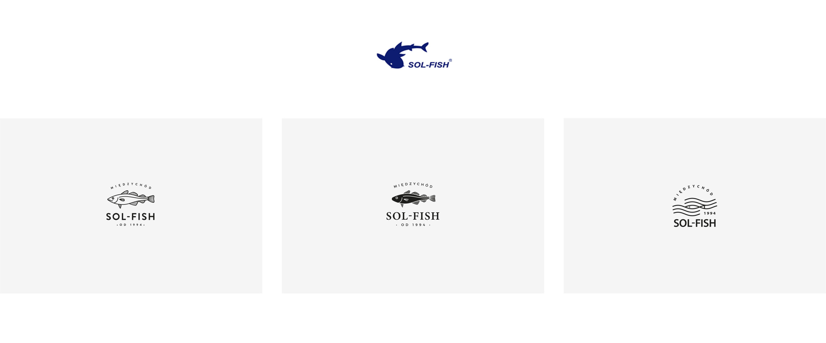
The final project is very simple, yet easy to understand. The incorporated date of the company’s foundation gives a message that it has been on the market for many years, which builds trust. The name of Międzychód city, where the company is located, closes the graphic form of the sign, and also evokes positive associations with another known food company originating in Międzychód.
2. PACKAGING
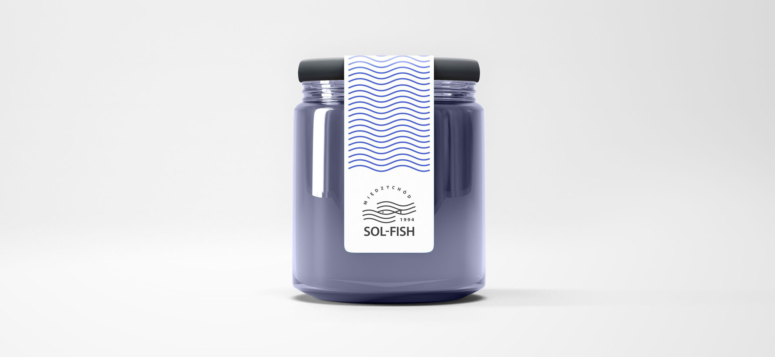
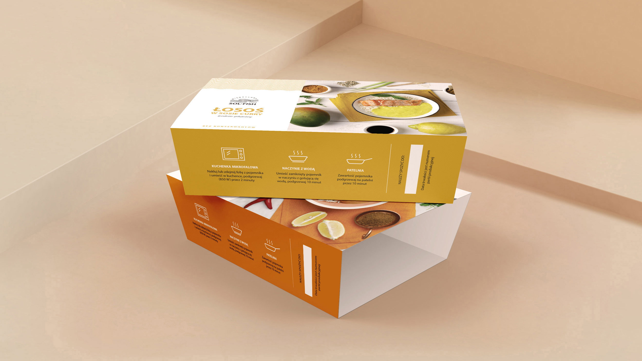
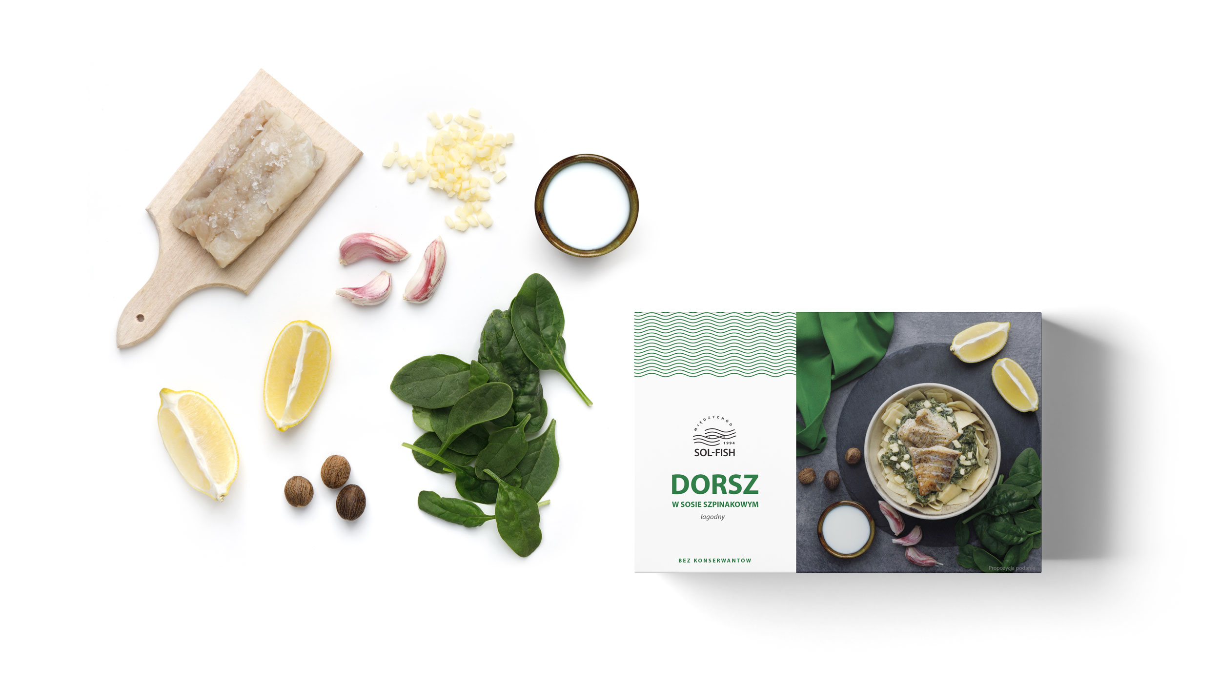
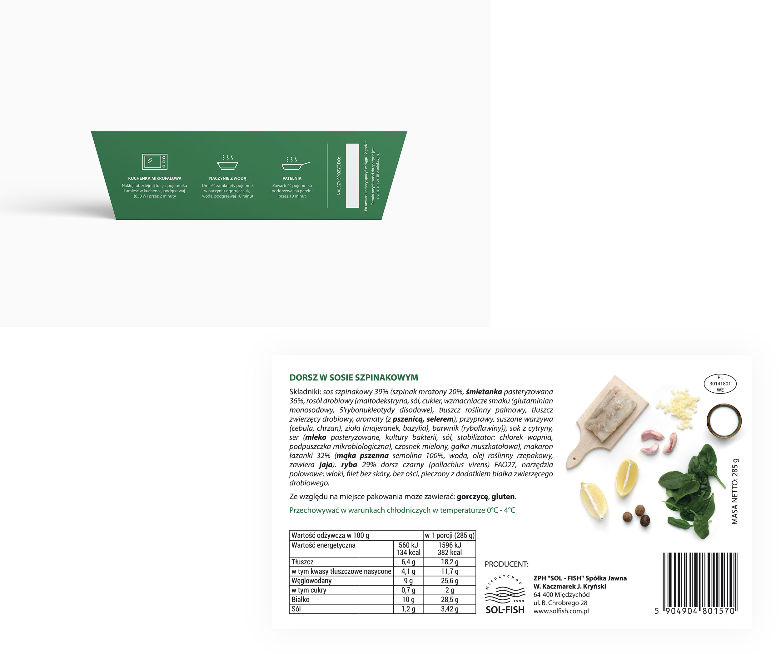
The target group for the new products are people between 20 and 40 years old, which is why it was crutial to design the logo and the packaging in a way that would instantly grab attention of the people in this age group.

3. WEBSITE


