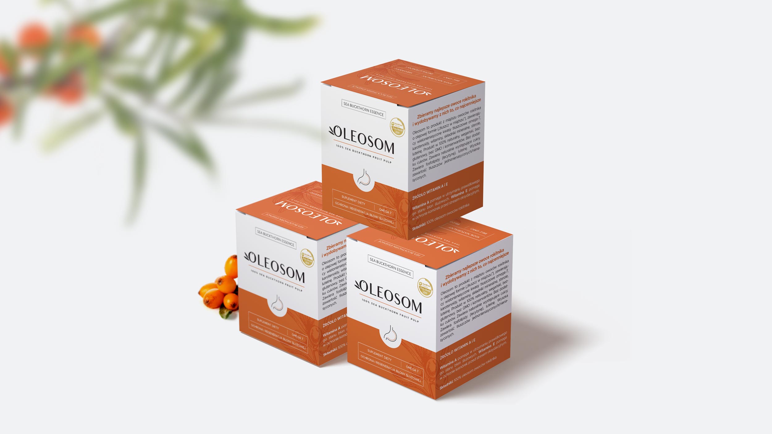
The Oleosom food supplement is a 100% natural, vegan product that is being sold in pharmacies.
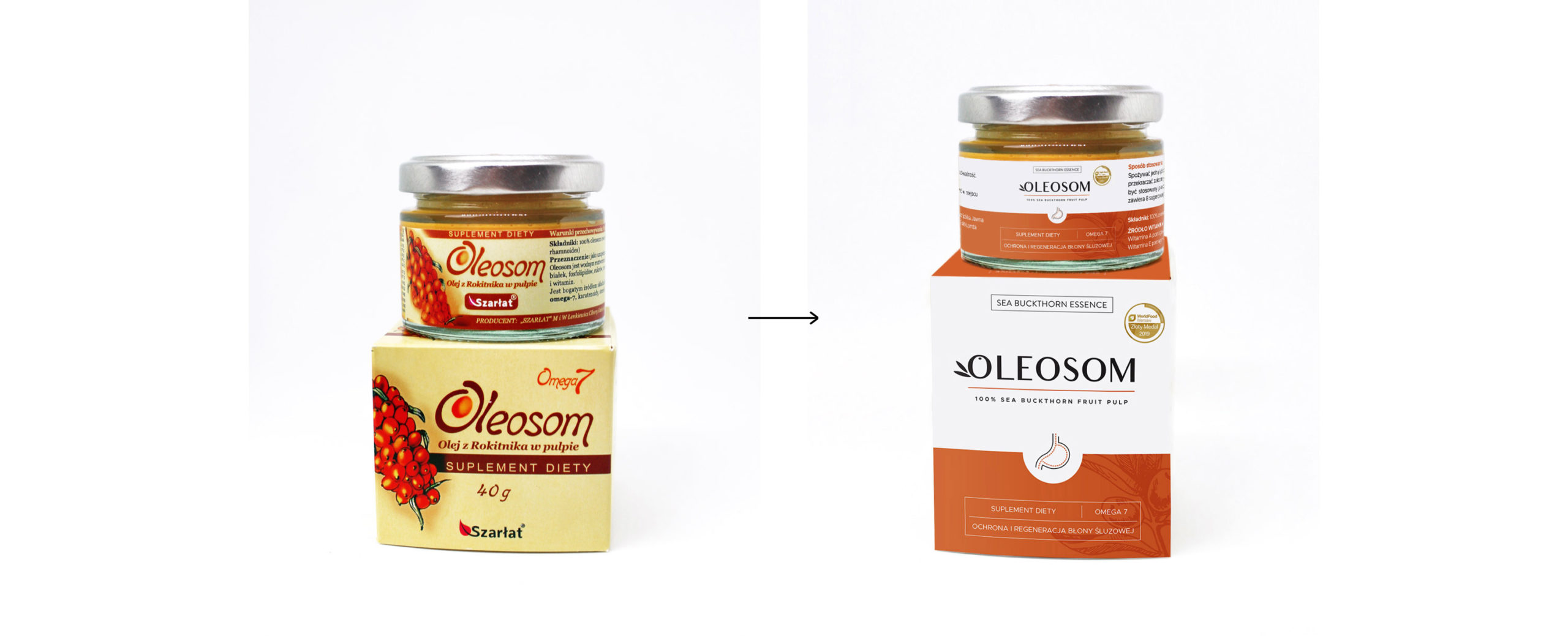
The client wanted to refresh it’s image, in order to make it look more modern, clean, and eye-catching.
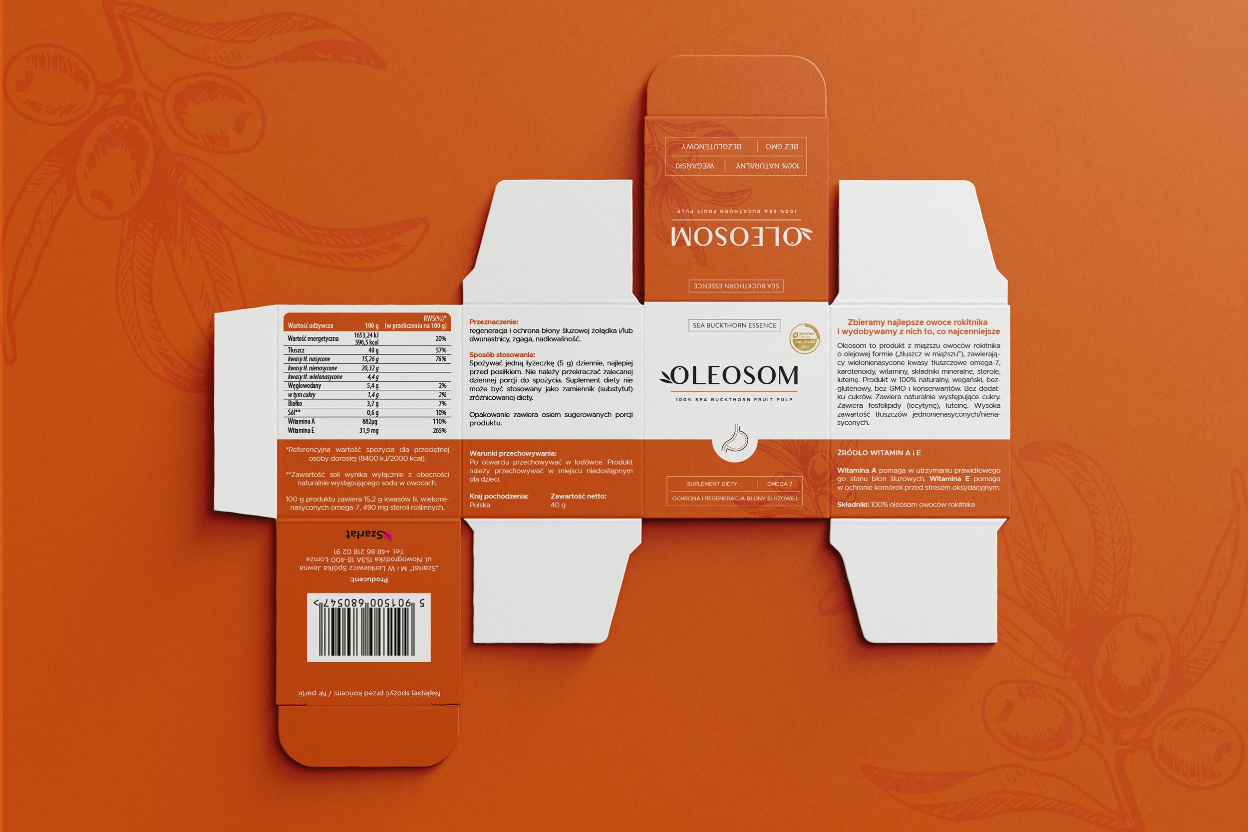
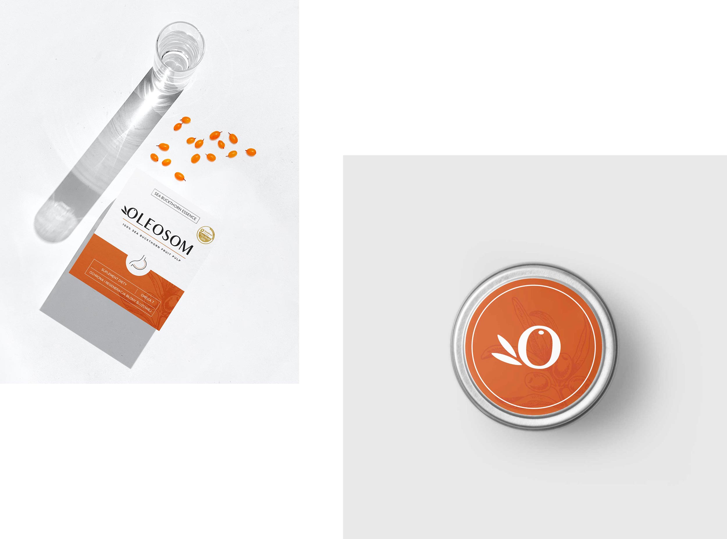
My work on this project included designing two logotypes – of the supplement itself, and of the umbrella brand Sea Buckthorn Essence – as well as the packaging, label, and the jar sticker for the product.
Key words for the rebranding:
minimal | transparent | harmony | health | nature
1. LOGO
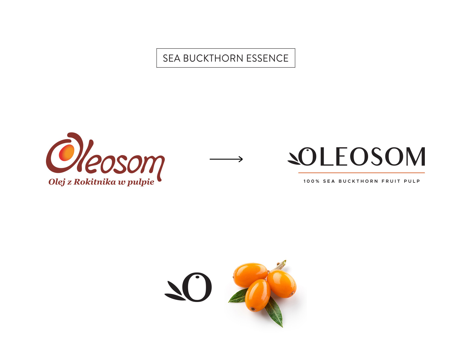
Both the umbrella brand, and the product logos were supposed to be very simple and legible.
Letter O in the Oleosom logo refers to the shape of sea buckthorn fruit that the supplement is made of.
2. PACKAGING
The main problem of the previous packaging was the fact that its design looked a bit outdated when compared to other similar products that are available in pharmacies.
The client wanted the new packaging to have accents in a colour that refers to the sea buckthorn fruits, as well as a graphic representation of the product protecting the gastric mucosa. The new packaging was also going to be 1 cm higher than the previous one, in order to fit a little spoon inside.
